In a crowded supermarket aisle—where 30,000+ products compete for attention—or an endless online scroll through e-commerce platforms, a food product has a mere 3–7 seconds to capture a shopper’s gaze and convince them to pause, reach out, or click. In this make-or-break moment, the packaging is far more than a protective shell; it is the “silent salesman”—a strategic communicator that speaks to consumers’ emotions, values, and unspoken needs before a single word is read. Effective packaging design is a sophisticated blend of art, behavioral science, and market insight, crafted to cut through the noise, build instant connection, and ultimately drive purchasing decisions.
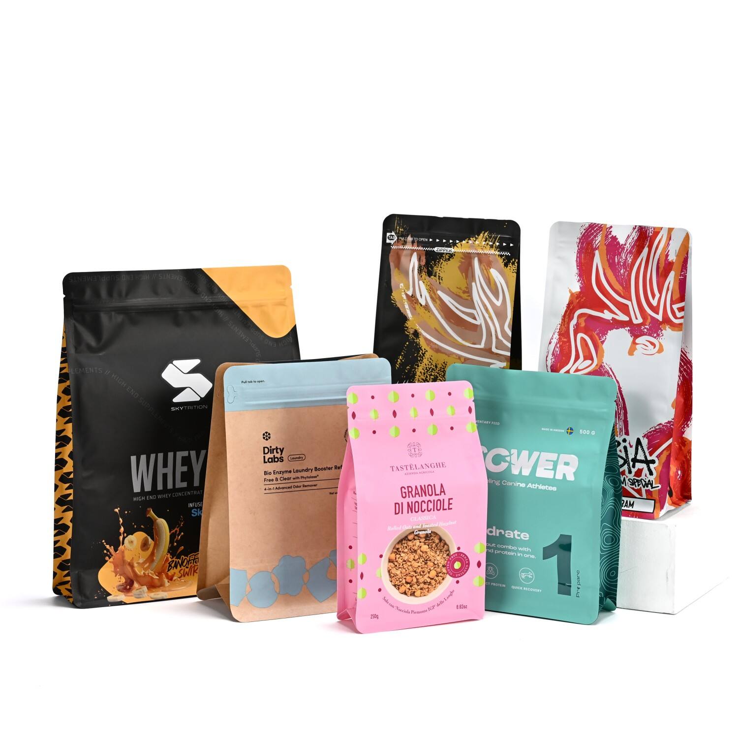
The psychology of packaging design operates on subconscious levels, starting with color—the most immediate and impactful visual cue. Green, for instance, is not just a color; it’s a shorthand for “natural,” “organic,” and “wholesome.” Brands like Whole Foods’ 365 Everyday Value line lean heavily on soft greens to signal clean, unprocessed ingredients, while Beyond Meat uses vibrant green accents to tie its plant-based products to freshness and sustainability. Blue, by contrast, evokes trust and calm: think of the cool blue tones on bottles of Poland Spring water, which subtly reinforce the idea of purity and reliability. Red, a color linked to energy and appetite, is a staple for brands like Coca-Cola and Doritos, as it triggers excitement and encourages impulse buys. Even minimalist white has a role to play—it conveys premium quality and simplicity, as seen in luxury brands like Aesop’s skincare or Whole Foods’ premium cheese packaging, where white negative space lets the product (or its high-end positioning) take center stage.
Typography, too, is a quiet storyteller. A handwritten script—like the cursive font on Annie’s Homegrown macaroni and cheese boxes—suggests warmth, nostalgia, and artisanal craftsmanship, appealing to parents seeking “homemade” or “small-batch” vibes. On the flip side, a bold, clean sans-serif font (such as the one used by Amazon Basics or Target’s Up&Up line) communicates modernity, efficiency, and reliability, perfect for shoppers prioritizing practicality and value. Even the size and spacing of text matter: larger, bolder fonts for key claims (“Gluten-Free!”) ensure they’re noticed in a hurry, while smaller, lighter fonts for secondary information (like ingredient lists) keep the design uncluttered without hiding critical details.
Shape, texture, and imagery complete the sensory experience, turning a flat design into something that feels tangible and memorable. A matte finish, for example, adds a tactile layer of premiumness—think of the soft, non-glossy surface of a Lush shampoo bar wrapper, which feels more luxurious than a shiny plastic bag and signals “natural” by avoiding reflective, industrial-looking materials. Resealable zippers, meanwhile, speak to practicality: a bag of Lay’s potato chips with a sturdy zipper doesn’t just keep chips fresh; it tells consumers, “We care about your convenience,” turning a one-time purchase into a repeat buy (since leftover chips won’t go stale). Imagery, too, is intentional: farm landscapes on packages of Horizon Organic milk connect to stories of ethical sourcing, while clear windows on boxes of Entenmann’s pastries build trust by letting the product “speak for itself”—shoppers can see the flakiness of a croissant or the ripeness of a muffin, eliminating the fear of “hidden” quality issues. Crucially, modern design must balance aesthetic appeal with clarity: claims like “non-GMO,” “plant-based,” “30% less sugar,” or “compostable package” need to be instantly visible—often placed in the “golden triangle” (the top-right corner of a package, where eyes naturally first land) to avoid getting lost in busy designs.
The rise of e-commerce has added a new layer of complexity to packaging psychology, reshaping how designs must perform. In the digital space, a package must first be “thumbnail-friendly”: bold colors and simple, recognizable shapes (like the iconic roundness of a Haagen-Dazs pint) stand out in a grid of tiny online images, where cluttered designs blur into the background. Second, it must double as a “shipping container”: sturdy structures (like Amazon’s frustration-free packaging) protect products during transit, but also send a message—durable packaging suggests a brand is thoughtful and reliable, reducing the risk of negative reviews from damaged goods. Finally, it must deliver a memorable “unboxing experience”: brands like Glossier have turned this into an art, using pastel tissue paper, handwritten notes, and branded stickers to make opening a package feel like receiving a gift. This not only delights customers but also encourages them to share their unboxing moments on social media (Instagram, TikTok, or Pinterest), turning shoppers into unpaid brand advocates who expand reach organically.
Furthermore, today’s consumers—especially Gen Z and millennials—seek authenticity and alignment with their values, and packaging is the primary vehicle for brands to prove this. Using recycled materials (like Patagonia Provisions’ boxes made from 100% post-consumer waste) isn’t just an eco-friendly choice; it’s a visual statement that says, “We share your commitment to the planet.” Minimalist designs, which use less ink and material, signal “conscious consumption,” while prominent eco-certifications (like the BPI compostable logo or Fair Trade seal) provide tangible proof of sustainability claims—no longer “nice-to-haves,” these elements are expectations that directly influence the choices of ethically minded shoppers. A 2024 Nielsen study found that 67% of consumers are willing to pay more for products with sustainable packaging, and 83% say packaging design plays a key role in whether they perceive a brand as “authentic.”
Our design philosophy is rooted in this deep understanding of consumer psychology and evolving market trends. We don’t just collaborate with brands to create a container—we craft a cohesive brand narrative that works both on physical shelves and digital screens. From the structural engineering that ensures a package survives shipping while feeling premium to the graphic elements that tell a brand’s unique story (whether it’s a family-owned farm’s heritage or a startup’s mission to reduce plastic waste), we build packaging that does three key things: protect the product, persuade the consumer, and perform in every channel. In a marketplace where shoppers are overwhelmed with choices, intelligent, consumer-centric design isn’t just a competitive advantage—it’s the ultimate differentiator that turns casual browsers into loyal customers.