In today's competitive retail landscape, packaging design plays a crucial role in capturing consumer attention and driving purchase decisions. Stand up pouches have emerged as one of the most versatile and effective packaging solutions across various industries, from food and beverages to cosmetics and household products. These flexible packaging options offer brands an exceptional opportunity to create memorable shelf presence while providing practical benefits for both manufacturers and consumers. The strategic design of stand up pouches can significantly impact product visibility, brand recognition, and ultimately sales performance in crowded retail environments.
Understanding the Visual Impact of Stand Up Pouches
Vertical Display Advantages
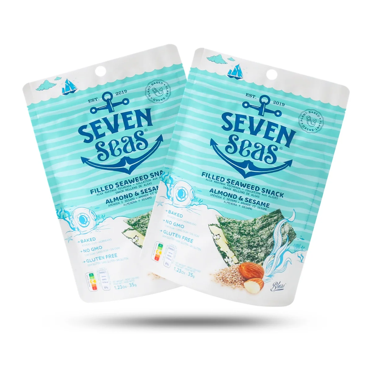
The vertical orientation of stand up pouches creates an immediate advantage on retail shelves compared to traditional horizontal packaging formats. This upright positioning maximizes the visible surface area available for branding and product information, allowing designers to create bold, eye-catching graphics that stand out from surrounding products. The natural tendency for consumers to scan shelves horizontally means that vertically oriented stand up pouches can interrupt this pattern and draw attention more effectively. Research in retail psychology indicates that products positioned vertically are perceived as more premium and innovative, contributing to enhanced brand perception and increased purchase intent.
The three-dimensional structure of stand up pouches also provides additional surface area for design elements compared to flat packaging alternatives. This expanded canvas allows for wraparound graphics that can tell a complete brand story while maintaining visual consistency across all viewing angles. When properly designed, stand up pouches can create a billboard effect on crowded shelves, using their prominent positioning to communicate key product benefits and brand values at a glance. The structural stability of these pouches ensures that graphics remain clearly visible even when shelves are fully stocked, maintaining brand visibility throughout the product lifecycle.
Color Psychology and Brand Recognition
Color selection plays a fundamental role in the effectiveness of stand up pouches as marketing tools. Strategic use of color can evoke specific emotional responses, communicate product attributes, and facilitate brand recognition within seconds of consumer exposure. Bold, contrasting colors help stand up pouches achieve maximum shelf differentiation, while complementary color schemes can create visual harmony that appeals to target demographics. Understanding color psychology enables designers to select palettes that not only attract attention but also align with brand personality and product positioning strategies.
The flexible nature of stand up pouches allows for innovative color applications that may not be feasible with rigid packaging formats. Gradient effects, metallic finishes, and specialty coatings can transform basic stand up pouches into premium-looking packages that command higher perceived value. Color consistency across different sizes and variants of stand up pouches helps establish strong brand families on retail shelves, making it easier for loyal customers to locate and purchase preferred products. This visual cohesion also supports brand extension strategies by creating instant recognition when new products are introduced under existing brand umbrellas.
Structural Design Elements for Maximum Appeal
Shape Innovation and Differentiation
While traditional stand up pouches feature standard rectangular profiles, innovative shape modifications can create distinctive shelf presence that sets products apart from competitors. Custom die-cutting techniques allow for unique contours that reflect brand personality or product characteristics, such as curved edges for organic products or angular designs for technical applications. These shape variations help stand up pouches achieve instant recognition and create memorable brand impressions that extend beyond initial purchase occasions.
Gusset design represents another critical structural element that impacts both functionality and visual appeal of stand up pouches. Side gussets can be engineered to create specific proportions that optimize shelf space utilization while maintaining structural integrity. The width and depth ratios of stand up pouches should be carefully calculated to ensure stable positioning while maximizing visible branding area. Advanced manufacturing techniques now enable the creation of asymmetrical designs that challenge conventional packaging norms while maintaining the practical benefits that make stand up pouches popular with both retailers and consumers.
Window and Transparency Features
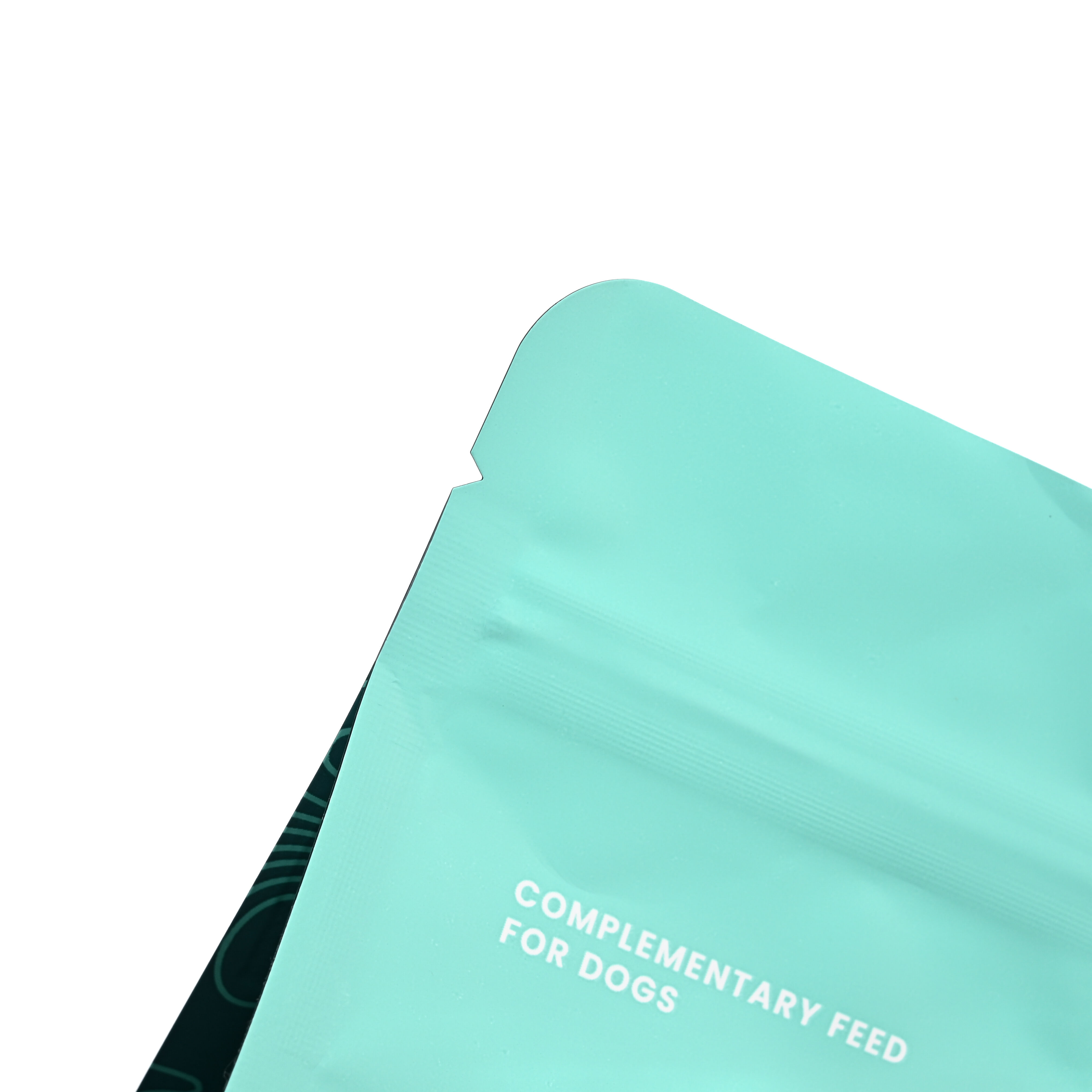
Transparent windows strategically incorporated into stand up pouches can dramatically enhance product appeal by allowing consumers to see actual contents before purchase. This transparency builds trust and confidence, particularly important for food products where visual quality assessment influences buying decisions. The placement and size of these windows require careful consideration to balance product visibility with structural integrity and branding space availability. Modern materials technology enables the integration of clear films that maintain barrier properties while providing crystal-clear product visibility.
Full-front transparency represents an emerging trend in stand up pouches design, where the entire front panel showcases product contents while branding elements are concentrated on side panels or back surfaces. This approach works particularly well for premium products where visual appeal of contents serves as a primary selling point. However, successful implementation requires careful attention to background graphics and substrate selection to ensure that product visibility enhances rather than detracts from overall package aesthetics. The interplay between transparent and opaque areas can create sophisticated visual effects that elevate perceived product value.
Typography and Information Hierarchy
Font Selection for Readability
Typography choices significantly impact the effectiveness of stand up pouches in communicating essential product information and brand personality. Font selection must balance aesthetic appeal with practical readability requirements, considering typical viewing distances and lighting conditions in retail environments. Sans-serif fonts generally provide better legibility on flexible packaging materials, while serif options may be appropriate for premium positioning strategies. The curvature and flexibility of stand up pouches can create optical distortions that affect text readability, requiring careful font sizing and spacing adjustments during design development.
Custom typography can help stand up pouches achieve distinctive brand recognition while ensuring consistent communication across product lines. Proprietary font families enable brands to establish unique visual identities that cannot be easily replicated by competitors. However, custom typography must be rigorously tested across various sizes and applications of stand up pouches to ensure consistent performance. The integration of typography with graphic elements should create seamless visual flow that guides consumer attention through key product information in logical sequence.
Information Organization Strategies
Effective information hierarchy on stand up pouches requires strategic organization of product details, regulatory requirements, and marketing messages to maximize communication efficiency within limited space constraints. Primary information such as brand names and product identifiers should occupy prominent positions that remain visible regardless of shelf positioning or stocking density. Secondary details including ingredient lists, nutritional information, and usage instructions can be positioned on back or side panels where consumers can access them during detailed product evaluation.
The vertical format of stand up pouches creates unique opportunities for layered information presentation that follows natural reading patterns. Top-to-bottom information flow can guide consumers through brand recognition, product identification, key benefits, and supporting details in logical progression. This structured approach to information organization helps stand up pouches function effectively as silent salespeople, providing all necessary decision-making information while maintaining visual appeal that encourages initial product consideration.
Finishing Techniques and Special Effects
Coating and Lamination Options
Surface treatments and specialized coatings can transform basic stand up pouches into premium packaging solutions that command attention and justify higher price points. Matte finishes provide sophisticated aesthetics while reducing glare and fingerprint visibility, making them ideal for premium consumer goods. Glossy coatings enhance color vibrancy and create eye-catching reflections that help stand up pouches stand out under retail lighting conditions. The choice between matte and gloss finishes should align with overall brand positioning and target market preferences.
Advanced coating technologies enable the application of specialized effects such as soft-touch finishes that provide tactile appeal or barrier coatings that extend product shelf life. These functional enhancements add value for both consumers and retailers while creating differentiation opportunities in crowded market segments. Multiple coating applications can be combined on single stand up pouches to create sophisticated visual and tactile experiences that reinforce premium positioning. The durability of these coatings throughout distribution and retail handling must be considered during selection and application processes.
Embossing and Texture Applications
Three-dimensional surface effects created through embossing techniques add tactile interest and visual depth to stand up pouches that cannot be achieved through printing alone. Raised or recessed patterns can highlight specific branding elements, create texture zones that enhance grip, or simply add premium aesthetics that justify higher price positioning. The flexible nature of stand up pouches requires careful consideration of embossing depth and pattern complexity to ensure structural integrity is maintained throughout product handling and storage.
Texture applications through specialized printing techniques can simulate various material surfaces such as fabric, metal, or natural textures that align with product characteristics or brand personality. These effects help stand up pouches achieve distinctive shelf presence while communicating specific product attributes through visual and tactile cues. Combination approaches that integrate embossing with textured printing can create sophisticated packaging solutions that rival rigid alternatives in terms of perceived quality and consumer appeal.
Market Research and Consumer Testing
Shelf Visibility Studies
Systematic evaluation of stand up pouches performance in actual retail environments provides invaluable insights for optimizing design elements and maximizing shelf impact. Visibility testing should encompass various lighting conditions, shelf positions, and competitive contexts to ensure consistent performance across diverse retail scenarios. Eye-tracking studies can reveal which design elements of stand up pouches capture initial attention and guide consumer focus through key information areas. These scientific approaches to design validation help eliminate guesswork and ensure that investment in premium packaging features delivers measurable returns.
Comparative analysis against competing products in similar stand up pouches formats reveals opportunities for differentiation and identifies successful design strategies that can be adapted or improved upon. Mock-up displays that simulate actual retail conditions allow for realistic assessment of how different design alternatives perform when surrounded by competitive products. This testing phase is crucial for identifying potential issues such as insufficient contrast, poor readability, or inadequate brand recognition that might not be apparent during isolated design review processes.
Consumer Preference Research
Direct consumer feedback through structured research programs provides essential insights into how target audiences respond to different design elements of stand up pouches. Focus groups can explore emotional responses, purchase intent, and perceived value associations that influence buying decisions. Quantitative surveys enable measurement of preference intensity and identification of design elements that most strongly influence consumer choice. This research should encompass both current customers and potential new users to ensure that design strategies support both retention and acquisition objectives.
Demographic analysis reveals how different consumer segments respond to various design approaches for stand up pouches, enabling targeted optimization strategies. Age, income, lifestyle, and cultural factors all influence packaging preferences and can guide decisions about color palettes, typography styles, and graphic approaches. Understanding these preferences enables brands to create stand up pouches that resonate strongly with core target audiences while maintaining broad market appeal. Regular research updates ensure that design strategies remain aligned with evolving consumer preferences and market trends.
FAQ
What makes stand up pouches more effective than traditional packaging for shelf impact
Stand up pouches offer superior shelf impact due to their vertical orientation, which maximizes visible branding area and creates natural attention-drawing properties. Their flexible structure allows for innovative shapes and design applications that rigid packaging cannot accommodate, while their prominent positioning on shelves ensures consistent visibility regardless of stocking density. The three-dimensional surface area provides more space for compelling graphics and product information compared to flat packaging alternatives.
How important is color selection in stand up pouches design
Color selection is crucial for stand up pouches effectiveness, as colors trigger immediate emotional responses and facilitate brand recognition within seconds of consumer exposure. Strategic color choices can communicate product attributes, differentiate from competitors, and align with target demographic preferences. The flexible materials used in stand up pouches allow for sophisticated color applications including gradients, metallics, and specialty effects that enhance perceived value and shelf presence.
What role does typography play in stand up pouches success
Typography significantly impacts how effectively stand up pouches communicate essential product information and establish brand identity. Font selection must balance aesthetic appeal with practical readability requirements, considering typical retail viewing conditions and the curvature of flexible packaging materials. Well-designed typography creates clear information hierarchy and guides consumers through key product details in logical sequence, functioning as an effective sales tool.
How can brands measure the effectiveness of their stand up pouches design
Brands can measure stand up pouches design effectiveness through shelf visibility studies, consumer preference research, and sales performance analysis. Eye-tracking studies reveal which design elements capture attention most effectively, while consumer feedback provides insights into purchase intent and perceived value. Comparative testing against competitors in realistic retail environments helps identify optimization opportunities and validates design decisions before full market launch.